
Balancing Energy With Color Combinations

Balancing energy with color combinations can truly transform your space. For a lively atmosphere, try vibrant pairs like yellow and blue; they spark creativity and motivation. For a more serene environment, consider softer tones such as pastel greens and peach, which create a calming effect. Alternatively, if you want to infuse your kitchen with a sense of vitality, opt for colors that uplift kitchen energy, such as sunny oranges and cheerful aquas. These combinations not only enhance the mood but also encourage connection and conversation among family and friends.
If you're aiming for calm, opt for soft blues or greens with neutral tones to create a soothing effect. You can use the 60-30-10 rule to distribute colors effectively, making one shade the focal point while supporting it with neutrals.
Whether it's your living room or workspace, find the right mix that evokes the mood you want. There's more to explore about how color can energize your environment and enhance your well-being.
Understanding Color Psychology
Consider how colors influence emotions and decisions daily.
While color associations differ individually, some hues generally evoke similar feelings—blue often brings calmness, red can spark passion or urgency.
By understanding these, you can enhance mood or productivity through color.
Try painting a room in a soothing shade or adding vibrant accents for energy.
Observe the effects and experiment to create a supportive environment for emotional well-being.
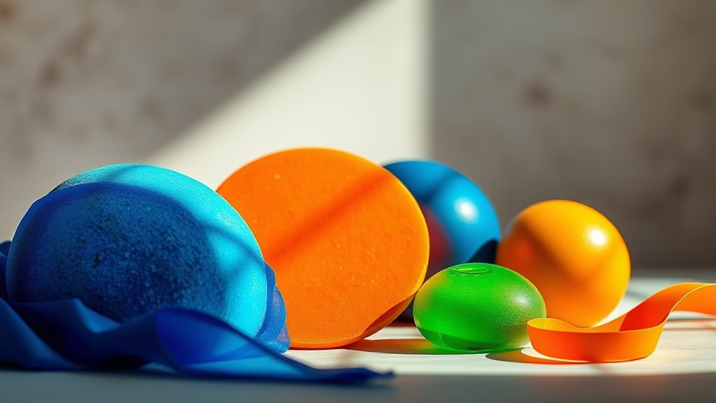
Energizing Color Palettes
Energizing color palettes can transform a space by sparking motivation and enthusiasm. Use vibrant contrasts, such as bright yellows with deep blues, to stimulate creativity and energy.
Warm tones like fiery reds and sunny oranges enhance this effect, making a room inviting and dynamic. Consider accent walls or bold decor in these colors to create focal points, and balance them with neutral backgrounds to prevent sensory overload.
Experiment with different shades to find the perfect mix that inspires and uplifts you daily.
Calming Color Combinations

Achieve serenity in your space with calming color combinations that enhance relaxation. Incorporate serene hues like soft blues, gentle greens, or muted lavenders to soothe your mind and spirit.
Consider these pairings:
- Light gray with pale blue for a cool, calming effect.
- Soft peach with off-white for warmth and comfort.
- Sage green with cream for a natural, rejuvenating vibe.
These combinations not only enhance aesthetics but also reduce stress and anxiety, transforming your home into a sanctuary of peace.
Practical Tips for Implementation
To create a harmonious environment with calming colors, start by selecting a focal point in your room, like a feature wall or a piece of furniture.
Use color pairing techniques to complement it, with soft blues or greens alongside neutral tones for a soothing effect.
Consider eco-friendly paints and materials for environmental impact.
Apply the 60-30-10 formula: 60% dominant color, 30% secondary, and 10% accent.
These techniques will help you craft a peaceful, inviting space that enhances well-being.
Color Combinations in Different Spaces
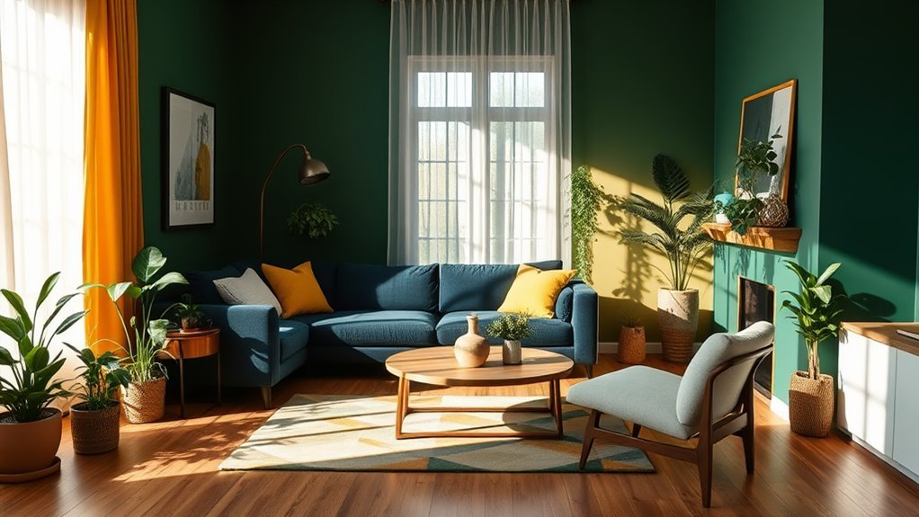
Creating a calming environment involves not just choosing colors but also how they interact in different spaces.
In the living room, soft blues and greens promote relaxation, while warm neutrals add coziness. For a workspace, energizing yellows or vibrant oranges boost creativity and focus.
- Balance cooler shades with earthy tones in the living room.
- Use pops of color in the workspace for energy.
- Enhance colors with varied textures and finishes.
Frequently Asked Questions
How Do Cultural Differences Affect Color Interpretation and Energy?
Cultural differences shape how you interpret colors, influencing emotional resonance and cultural symbolism. What energizes one culture might evoke calmness in another, demonstrating the powerful impact of cultural context on your perception of color.
Can Color Combinations Influence Productivity in the Workplace?
Yes, color combinations can influence productivity in the workplace. By understanding color psychology, you can design your workspace to enhance focus and motivation, creating an environment that boosts efficiency and fosters creativity among employees. For instance, incorporating colors such as blue, which is known to promote calmness and concentration, can help employees stay focused on their tasks. Additionally, ensuring that the design elements take into account lighting and energy flow dynamics can further enhance the overall atmosphere of the workspace. By strategically combining colors with appropriate lighting, organizations can create an environment that not only nurtures creativity but also facilitates collaboration and innovation among team members.
What Colors Are Best for Enhancing Creativity?
To enhance creativity, you'll want to explore vibrant color palettes like blues for calmness, yellows for optimism, and reds for passion. Embrace creative color psychology; these hues can spark your imagination and boost innovative thinking.
How Do Personal Preferences Impact Color Energy Balance?
Your personal taste shapes how you perceive colors, influencing your emotional response. If you love warm tones, they energize you, while cooler shades might calm you. Understanding this balance helps create a harmonious environment tailored to you.
Are There Colors to Avoid for Certain Moods or Feelings?
When it comes to moods, think of colors like friends; some uplift, while others drag you down. You should avoid harsh reds and gloomy blacks, as they often trigger negative emotional responses through their color symbolism.
Conclusion
By thoughtfully selecting colors that resonate with your goals, you can create spaces that uplift or soothe your spirit. Embrace energizing palettes like vibrant yellows and lively oranges for motivation. Alternatively, opt for calming blues and soft greens to foster relaxation. Remember, it's not just about aesthetics; it's about how colors influence your mood and productivity. Take a moment to experiment with these combinations. Watch how they transform your environment into a harmonious haven.